Whenever you are trying to talk to your clients about actually attracting links (versus building them), there are always two types of excuses: either the niche is too boring, or there are no technical capabilities (in terms of a good design team and experience).
I don’t believe in boring niches – neither do I believe in the absence of design skills that would be able to prevent you from building an effective link bait. The beauty of the Internet promotion is that anyone can do that: It all comes down to how creative you are ready to get.
An infographic is perhaps one of the most effective ways you can convey information in a format that was made for sharing. Visually stimulating and a fantastic means of packing a ton of data into a small space, you see people linking to them through blogs, photo sharing sites and social networking sites more and more these days.
Infographics have been largely abused: There’s one popping up daily with overused design element with little research or thought behind it. They are no more as effective as they used to be. However really creative and cool ideas still work.
Below are five styles of infographics that are well known for producing results:
Venn Diagram
Tool: Creately.com
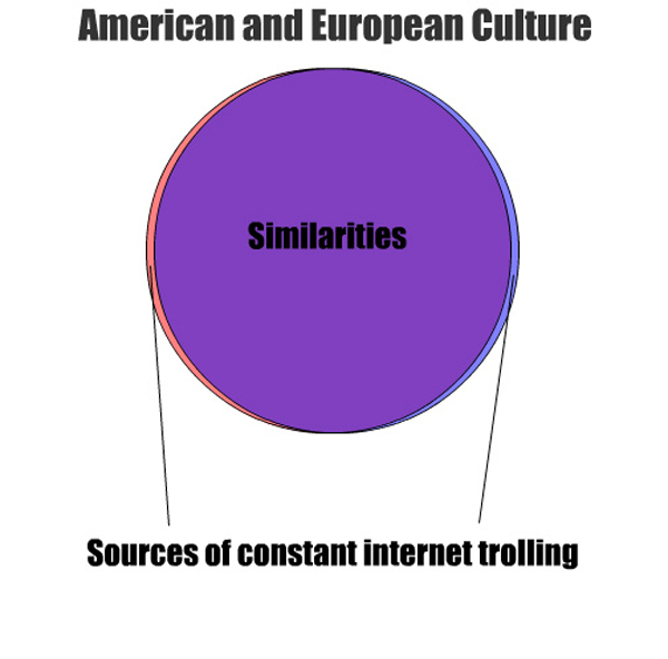
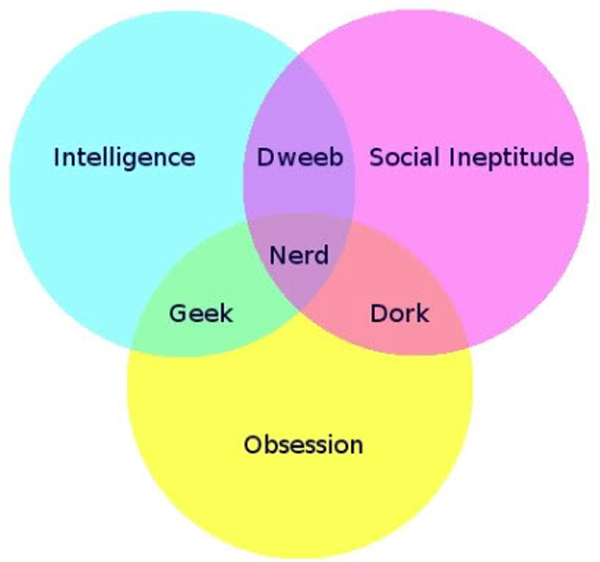
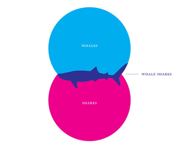
Venn diagrams have become some of the most popular on the web, usually providing entertaining data rather than anything too serious. It features two or more colored circles, each representing a different factor. They intersect at various points to indicate a shared element, and in the center they all intersect to show something with all provided qualities.
Examples:
1) American VS European Culture
2) Geek VS Nerd VS Dweeb VS Dork
3) Whale-Shark
Pie Charts
Tool: Canva
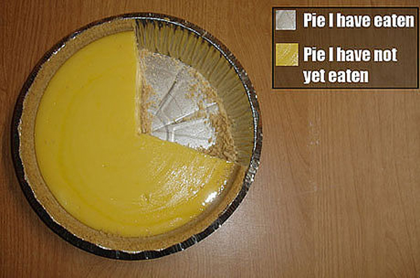
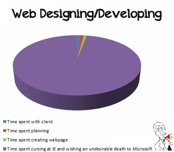
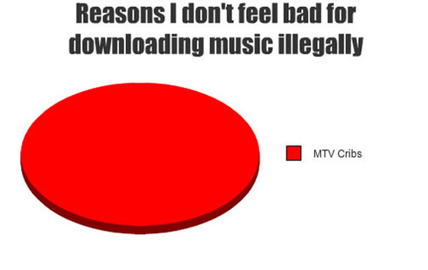
Pie charts are a popular item on social media sites. Certain websites, such as The Onion, used them on a regular basis to make a point or joke. With so many generators around the web to help you to make your own, it is now easier than ever to use a simple pie chart as a poignant infographic.
Examples:
4) Pie Eaten
5) Web Designing
6) Music Piracy
Flowchart
Tool: Lucidchart
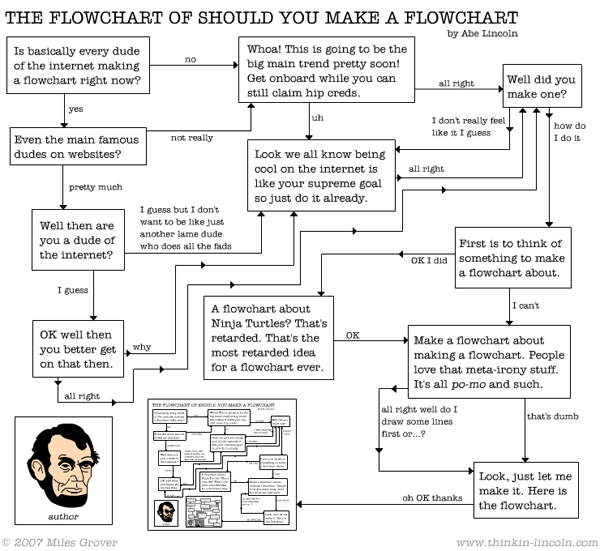
Flowcharts are excellent conveyers of information, because they are visually engaging. The viewer has to actually follow the chart from one end to the other, making it an interactive piece that sticks in the mind. One of the best parts about this style of infographic is that you can connect any number of elements and factors for a few eventualities that could be reached in several situations.
Examples:
7) Tech Support Cheat Sheet

8) Should I Make A Flowchart?
Timelines
Tool: Sutori
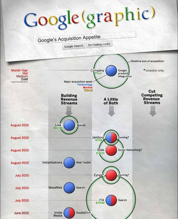
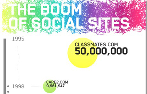
Used frequently to create an infographic about the history of anything, from a country to a brand, the timeline is one of your most effective visual data styles. It provides you with a platform for a clean, informative graph with endless potential for information. Even if the viewer is merely skimming the content for a specific fact.
Examples:
9) Google’s Acquisitions
10) The Boom of Social Sites
Periodic Table
Tool: Download the empty template and edit using Photoshop
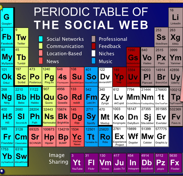
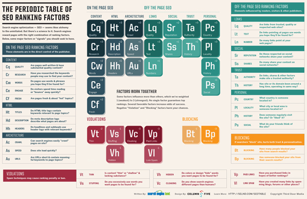
Because it is immediately recognizable, the periodic table has been used again and again for effective infographics. Usually, however, they are made with a double layer style that allows the user to skim over each “element” with their cursor to get more information. This is usually a good tactic as it is both interactive and more expansive than just the table itself might be.
Examples:
11) The Periodic Table Of The Social Web
12) SEO Ranking Factors
Conclusion
These five infographic types have been proven as effective styles time and again. But they also have the added benefit of being easy to create, with a lot of room for your own flair.
What are some examples of your favorites? Link to them in the comments.
The post 12 Cool Infographics That Work (and Don’t Require any Design Skills)! appeared first on Internet Marketing Ninjas Blog.
from Internet Marketing Ninjas Blog https://ift.tt/2KmulYK
via IFTTT

No comments:
Post a Comment