User experience (UX) is an essential element of website design and management, and it might impact more than you realize.
What happens when someone lands on your website for the first time? Does it load quickly? Can they tell they’re in the right place? Is it easy to figure out what to do next?
UX refers to the human experience of using your website. Which might leave you wondering how do you measure UX?
Why It’s Important to Measure UX
Website users are potential customers. Their ability to navigate your website becomes their experience and their impression of your company.
What do you think happens when a customer visits your website and can’t find the answer to their question? What if they can’t figure out how to check out of your online shop?
Whenever a user struggles to use your website, they might decide it’s not worth the trouble. On the other hand, creating a seamless experience is likely to result in successful conversions and repeat visits.
Which do you think will result in higher revenue?
Now you understand why it’s essential to understand how users use your site and fix whatever is causing their frustration. But how do you measure it?
Measure UX With These Helpful Metrics
Reduce guesswork by tracking and analyzing specific metrics to understand what exactly is happening when users land on your site (and why they leave.)
There are two main types of UX metrics: objective and qualitative.
Objective metrics are elements that have precise numbers attached to them to track and compare, such as time on task, success rate, or user errors. On the other hand, subjective metrics might give you information about how a user feels about the experience of using your website. They might include ease of use or satisfaction ratings.
Qualitative metrics measure customer experience quality on your site and include recommendations, satisfaction, and ratings. Behavioral metrics express in numbers how users are interacting with your website during their visit.
Google created the HEART framework, which offers a mix of objective and qualitative metrics to capture a full picture of UX. The framework acts as a guide to help you decide what metrics might be important to you. It measures happiness, engagement, adoption, retention, and task success.
It’s important to note that measuring UX might tell you what users are doing on your website, but it can’t tell you why or let you address challenges directly. You won’t be gathering names of customers to contact like you would a customer service issue.
Instead, this is a high-level view of what’s happening on your site, allowing you to try different features or solutions and see if the results are positive through A/B testing.
The list below covers different types of ways UX designers might measure UX as they create and update websites for optimal user experience and satisfaction.
1. User Interaction With Forms
Website forms are a common way for customers to contact you, sign up for information or special offers, and ask for quotes or specifications on a particular product.
They feel like an easy win because customer data is valuable, but many users balk at forms that ask for too much information or are a pain to fill out.
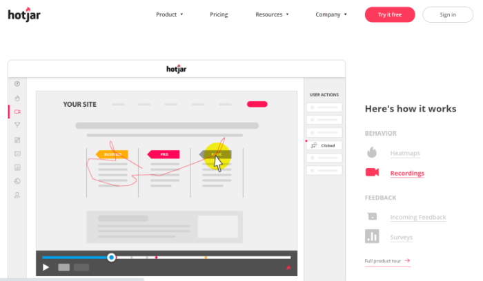
An easy way to figure out what customers think of your website forms is to use a tool like Hotjar to tell you necessary information like which aren’t being completed by some users and which information fields people decline to fill out.

Hotjar’s form feature can also provide you with video recordings to show how users interact with your forms on your site.
While the users may be anonymous, the information can be critical to making changes to your online forms. You’ll see where they seem to hesitate and which fields they skip. If users don’t finish the form and don’t submit their information, you’ve lost all data, so only ask for the minimum amount of information you need.
Remember to make the mobile version of your form easier to fill out because people are using a touchscreen instead of using a keyboard.
2. How Users Navigate Your Website
Wouldn’t it be great to know what your website visitors are doing and clicking on when they visit your website?
If you want to measure UX, this is valuable insight. Heatmaps can tell you where people click on your website, giving you insight as to how your layout and design might be helping or hurting you. Crazy Egg is a tool that offers this service.

Mine this information for both positive and negative feedback. You might notice that specific layout colors attract attention while your users ignore others. The positioning of features might affect engagement, as could the call to action.
Let’s say you notice your users seem to click on particular buttons on your website but ignore others. You can make adjustments to add more of the features they like and adjust areas they seem to ignore.
You can also use this insight when designing or editing other pages on your website and repeat features that your users seem to like.
Tracking and measuring where people click helps you gain insight. Options like Confetti, one of Crazy Egg’s features, can show you where the user clicks originated.
Did they come from another page on your website? Did they come from an ad on social media aimed at driving clicks to a product page? These tools will help you figure it out.
3. Usability Testing to Measure UX
You don’t need an expert to test website usability. In some cases, it can be more valuable to get feedback from people not on your team. Reach out to a few trusted people (friends, family, a few customers) to test your website’s usability.
Ask them to navigate through the site, fill out forms, complete a purchase if they can. They should aim to do whatever a new user to your website might try to do.
What works? What doesn’t? What steps are they unable to complete or found time-consuming? These are all critical areas to explore to see what you can do to smooth the experience.
Depending on what you want users to do on your site, you may be looking for feedback on if they found the site user-friendly and how quickly they could complete specific tasks.
Ask if there were any areas they had to stop progressing through the site, such as a form that didn’t submit properly or a purchase that didn’t go through.
4. Track Page Views and Time on Page
When users are willing to spend time on your site, it’s a promising sign that your site is easy to navigate. They’re likely comfortable and enjoying the experience and may visit multiple pages.
When you begin to measure UX, you may wonder how long an ideal website session might last. The answer depends on your site and what you want people to do when they visit.
Typically, you want users to be on each page long enough to gain the necessary information and take the next step towards conversion. Successful progress could be finding the call to action buttons that take them to the next page or signing up for an email newsletter.
However, very long time-on-page results could indicate a problem. Watch for other indicators like users choosing to leave your site after viewing a particular page for a long time or declining to fill out a form. The page itself may be confusing or a mismatch for the call to action you’ve chosen.
5. Run a Customer Success Survey to Measure UX
A customer success survey measures how satisfied visitors are with your site. It’s a great place to start measuring UX.
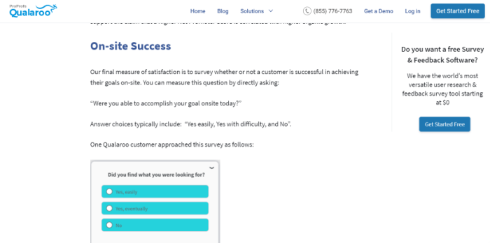
Ask about customer satisfaction, their willingness to recommend your product or service to others, and whether they accomplished their goals on your website during their visit. Did they find what they were looking for?

Use a tool like Qualaroo to gather responses from your customers, then use the information to make changes to your website. Your goal will always be to make the experience as seamless as possible, so breaking down obstacles is worth the time and effort.
6. Lean on Your Customer Service Team
Who do your customers turn to when they can’t find what they need on your website? Your customer service team.
Your service team is a likely source of repeated questions and complaints about difficulties using the website.
Some of these may be issues you can fix or information gaps you can fill. Your customers may also be unhappy with updates you’ve made to the site. A fancy new feature is only as valuable as the users can use it successfully.
Look for common issues and track customer complaints, then use that data to find and fix UX issues.
7. Track Page Load Speed to Measure UX
If you want users to stick around and see what you have to offer, your website should load quickly. Page load speed is a crucial element that affects search engine rankings and UX.
According to Unbounce, nearly 70 percent of consumers say that page speed affects their desire to purchase from an online retailer. And over 36 percent say slow loading time makes them less likely to return to an ecommerce site the next time. Those lost users can result in significant losses to your bottom line.
What factors tend to slow down your page loading speed? Large image and video files can often be the culprit. Here are a few ways to increase page loading time.
Google’s PageSpeed Insights is a handy tool to check how fast your website loads. It can help you flag which pages are causing you problems and which issues are causing the delay. With a bit of effort, you can score 100 percent on Google PageSpeed Insights.
If your page load speed is too slow, consider revising the images or compressing your video files. You can use tools like Optimizilla or TinyPNG, which works across all platforms.
Conclusion
Once you build your first website, you might think you’ve done most of the work. But maintaining a website that works for your users takes ongoing effort.
A useful website needs to help grow with your business, which means you’ll always need to measure UX and see how effectively your website is doing its job.
The design, layout, images, and copy all matter, of course. However, functionality matters just as much. If you want visitors to convert, you need to find and fix obstacles to conversion.
There are always ways to streamline the ongoing challenge of keeping your UX at an optimal level. Digital consulting can help measure your UX, and more importantly, actually use the data and feedback you collect.
Have you used any of the above methods to measure UX on your website? What were your results?
The post 7 Ways to Measure Your Website’s UX appeared first on Neil Patel.
from Blog – Neil Patel https://ift.tt/33oDdUk

No comments:
Post a Comment