As a marketer, you already know how hard it can be to drive conversions.
More often than not, when you ask a user to take an action, they do the exact opposite and abandon the form fill or their shopping cart.
If this scenario sounds familiar, you’re not alone.
The struggle of conversion plagues many marketers across every industry.
While there are many steps and strategies you use to drive conversions, you still might not see the needle move in the right direction.
If you’ve optimized for conversion and are looking for other ways to drive action, consider adding a progress bar to your site.
Used by large and small companies alike, a progress bar lets users know where they are in the process of completing a specific action, such as filling out a form or making a purchase.
In this post, I’ll break down why progress bars are so effective and how you can harness their power to drive conversions on your site.
What Is a Progress Bar?
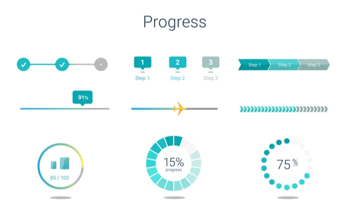
Progress bars are visual representations of how much progress a site visitor has made toward accomplishing a specific goal. For example, it might show users filling out a form they are about halfway done.
Progress bars can benefit your site both aesthetically and in terms of conversions.
You can use a progress bar in the checkout portion of your site to show users how close they are to a completed purchase, or across your site to delineate any number of charted movements.
While this tool may not seem like the obvious first choice for optimizing your conversion process, they’re actually quite effective.
Why Are Progress Bars Effective?
The average attention span is estimated to be around eight seconds. These days, eight seconds feels like an overestimate.
As marketers seek strategies to engage their audience in that brief window, gamification has become a popular strategy.
When we say gamification, we don’t literally mean incorporating games like tic-tac-toe into your marketing emails (although if that works for you, we want to hear about it). When we say gamification, we mean incorporating aspects of gaming into your strategy.
By incorporating game-like aspects like the progress bar, user engagement improves drastically. Think about when you play a video game, and it shows you on a map where you are in the process of meeting the next boss. Or, in a driving game the map might show how far you are from the finish line.
This small change can give users the confidence to complete a task because they know the end is near.
What’s more, adding the progress bar element creates the ideas of movement, progression, and achievement, not to mention the aforementioned reduction of uncertainty. By creating a step-by-step tracker, the process is also humanized and personalized.
Where to Use Progress Bars on Your Website
Progress bars can be used across your marketing endeavors to drive conversions.
From emails, to surveys, to form fills, these versatile bars draw on our natural desire to complete tasks, making them a powerful tool in our marketing wheelhouse.
Three common areas that can be optimized by progress bars include:
Triggers
You can enable triggers on an action or a duration of time, including a consumer who is about to abandon a cart, when a certain amount of time has elapsed, or when a site visitor has interacted with a button or a link.
For example, if a user moves their mouse to X out of a page, you could trigger a progress bar that tells them there are only three steps left. Or, when someone stays on a check out page too long, you could display a progress bar assuring them there’s only one more step or showing them how close they are to an added bonus, like free shipping of a complimentary gift.
On-Site Display
Progress bars don’t have to be limited to classic conversion actions like checkout or form fill. Display these bars throughout your site to subtly notify your user of their progress toward a specific goal or use overlays that are more visually aggressive.
For example, you could show users how close you are to launching a free webinar or launching a new product.
However you use them, including progress bars throughout your website gives your users a clear and direct path to follow, influencing their journey in a directed manner.
Email Use
You can harness the power of progress bars throughout your email nurtures to underscore the need for immediate action. If you’re advertising a time-sensitive sale, consider adding these bars to your emails to drive home this message.
Within emails, progress bars can also encourage engagement, such as showing how much a consumer will need to spend to unlock free shipping.
Examples of Progress Bars on Websites
While the above three examples are great places to start, they should also serve as inspiration to the very real potential of progress bars.
To give you more ideas on how these versatile progress paths can drive conversions, here are my favorite progress bars.
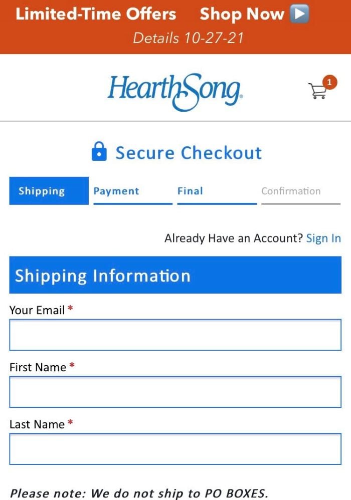
HearthSong
Childrens’ toy vendor HearthSong uses the most commonly encountered version of the progress bar.
Here, the company clearly lays out the four steps toward purchase, signaling to the user where they are in the process through differently colored tabs:

Kayak.com
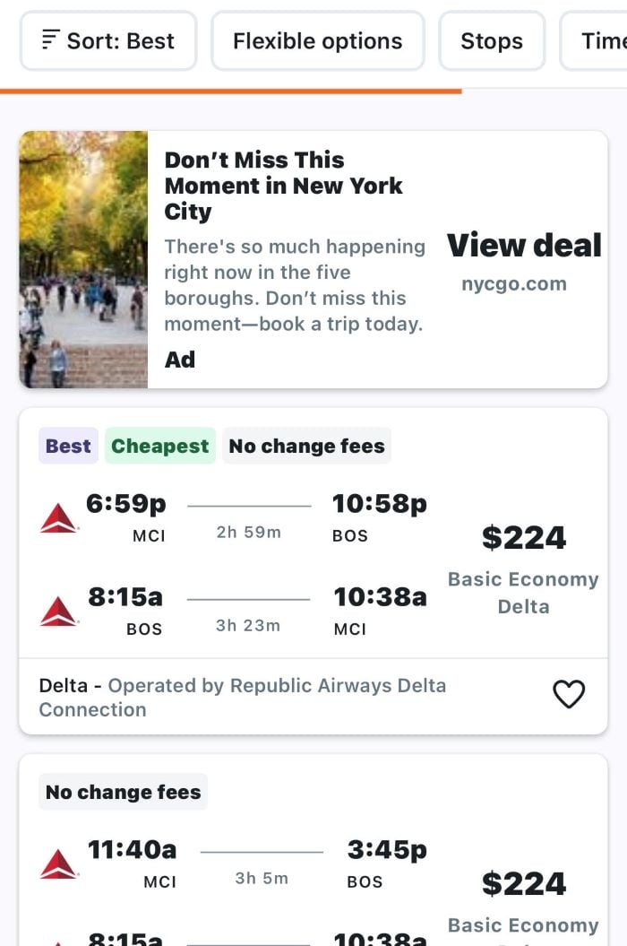
Discount travel comparison site Kayak.com uses a progress bar in their search function.
After a user has entered desired flight locations and dates, the site aggregates corresponding flight availability across the web.
To prove progress on this search and to discourage users from abandoning their would-be trip, Kayak employs a simple cylindrical progress bar to assure users that there are more flights on the horizon.
By using the bar to offer the promise of a better deal, users are more likely to stick around to see what the ultimate results will be, and thus more likely to convert.

Domino’s Pizza
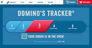
While many sites use progress bars during the nurture and sales process, Domino’s Pizza employs a progress bar after conversion completion.
This unique bar builds relationships with consumers by supplying near real-time updates about the status of their order.
To further increase personalization and sense of connection, Domino’s includes as much individualized information as possible, including Pizza Maker’s name.
By employing a progress bar that is personalized, Dominos increases trust, which increases the likelihood a consumer will revisit that trusted relationship.

Progress Bar Best Practices and Tips
Are you chomping at the bit to add a progress bar to your checkout page or next email? Before you get started, here are three best practices to keep in mind as you build out your progress bar strategy.
Calculate Costs of Creating a Progress Bar and Do a Breakeven Analysis
Much like any addition to your website’s functionality, you need to ensure a progress bar fits into your budget. After you’ve determined a ballpark figure for what you want to spend on a progress bar, the savvy marketer would be wise to conduct a breakeven analysis.
This formula will help you determine what needs to happen for your business to break even with the cost associated with the progress bar.
If you’re not looking for a custom bar, WordPress also offers a number of plugins you can choose from that can substantially reduce overhead on this functionality.
Your Progress Bar Should Provide Immediate Feedback
When we explored the psychology behind progress bars, we discussed the human affinity for a clearly-delineated path. When your progress bar includes an indicator like percentage complete or a step-by-step breakdown of where a user is in the buying process, you chart a path for users and remove ambiguities.
To ensure your users feel like your sales process or demo request process is transparent and clear-cut, use immediate feedback to share exactly where your user is in their respective journey.
Visual Characteristics
While a progress bar may look simple on its surface, there are many considerations to keep in mind if you want them to be truly successful.
Below, learn the three best practices for your bar’s visual characteristics.
- Progress bar changes should be highly visible, not subtle.
- If your progress bar is used to track the purchase process, titles on the bar should match those of their corresponding pages.
- Use elements that indicate completion, including check marks and xs.
By employing these key strategies, you can ensure your progress bar serves as a successful tool to guide your users along their journey on your site.
Progress Bar Creator Tools
As we briefly mentioned above, there are a number of tools you can use to create progress bars on your site. Ranging from free to premium pricing, these tools are a must if you’re looking to create a progress bar out-of-house.
Progress Bar Frequently Asked Questions
What is a progress bar?
A progress bar is a visual indicator that shows how far site visitors (or app users) are in completing a specific process, such as checking out or filling in a form. These trackers are used to encourage users to stay on course, ultimately driving conversions and improving user-experience.
Why are progress bars effective?
Progress bars are effective because they appeal to our universal desire to move forward and provide tangible proof of progress. They also serve as a “reward” for moving through the conversion process.
Where should I use progress bars?
The short answer? Everywhere. Depending upon your goals, you can incorporate progress bars into your email campaigns, user profiles, landing pages, and order forms. Bars are very versatile, you just need to strategize how and where these bars will best serve your campaign goals.
Are progress bars complicated to build?
While building a progress bar from scratch is no easy feat, there are a number of tools you can employ to help make your progress bar goals a reality. Ranging in price from free to premium, there’s a progress bar tool that fits every budget.
Progress Bar Conclusion
As you begin to consider your marketing strategy for the coming year, assess how your pages are converting.
If you’re seeing less-than-stellar rates, it’s time to consider optimizing your pages, forms, and on-page attributes. Progress bars are an easy-to-launch strategy to help users move through the conversion funnel with confidence.
These simple additions can go a long way in driving conversions and, if used creatively, can also deepen consumer relationships, build trust, and encourage loyalty.
What’s the most effective progress bar you’ve ever seen?
from Blog – Neil Patel https://ift.tt/3dypYHc

No comments:
Post a Comment