Pop-ups on websites are annoying. There, I said it.
Yet, if you look on my site, you’ll see I use them. In fact, I’ve always used pop-ups.
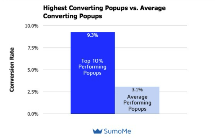
There’s a reason I use them—they work. The top 10 percent performing pop-ups have a whopping 9.28 percent conversion rate, according to a Sumo analysis.
Despite how annoying pop-ups can be (when used incorrectly), they’re incredibly effective at driving conversions, increasing email lists, and encouraging users to convert.
When used right, pop-ups aren’t annoying; they are helpful. Below, I’ll explore 15 suitable pop-ups and explain why they work.
First, let’s talk about what a pop-up on a website is and why so many sites still use them.
What Are Pop-Ups on Websites?
Pop-ups are graphical overlays that “pop up” on a website, usually after a user takes a specific action or is on the site for a certain amount of time. Unless you’re brand new to the internet, there’s a good chance you’ve seen a pop-up or two.
Many websites use pop-ups to gather email addresses, but you can also use them to:
- gather leads
- recover abandoned carts
- promote new products
- increase demo sign-ups
- segment your email list
- recommend related products
- suggest a different asset
- ask users to submit a question
Pop-ups are a little controversial though.
That’s because when pop-ups first came out they were everywhere. Sites would use two, three, even four pop-ups at a time. Some sites used them for spam or to play loud music.
Which means they were annoying.
As a result, many marketers (and regular internet users) hate pop-ups on websites.
I get it. However, things have changed, and I’ve seen the results myself.
Pop-ups on websites don’t have to be annoying—they just need to be useful.
In 2016, Google started cracking down on interstitials, especially on mobile devices. That meant sites with those annoying pop-ups had to get rid of them or risk falling in rankings.
Still, the sour taste lingered, and many websites and business owners think pop-ups are spammy.
The truth is, they can be incredibly effective—if you use them correctly.
Pop-ups on websites can encourage users to take any important action. As they “pop” up on websites unexpectedly, they grab users’ attention.
Even better? They won’t impact SEO if implemented correctly.
Why Do Websites Have Pop-Ups?
There are plenty of ways to encourage users to sign up for an ebook, join your email list, or watch a demo. Why use pop-ups on your website?
You should use pop-ups because they’re effective. According to OptiMonk, the average pop-up conversion rate is 11.09 percent. Other studies show a much lower conversion rate for pop-ups.
Sumo, for example, puts the average conversion rate around 3.1 percent.
This means if you get 1,000 visits a month, you could be losing up to 100 conversions a month by not using pop-ups.
Other reasons sites use pop-ups include:
- the targeting options make it easy to reach the right customers at just the right time
- A/B testing is simple and can help you quickly figure out which pop-up is most effective
- they’re attention-grabbing, which is crucial when attention spans get shorter
- pop-ups can be used to gather leads, drive email sign-ups, and increase sales
- Google doesn’t punish pop-ups if you use them correctly
15 Pop-Up Examples and When to Use Them
Now that you know why pop-ups are so popular, let’s look at a few examples from top-rated sites.
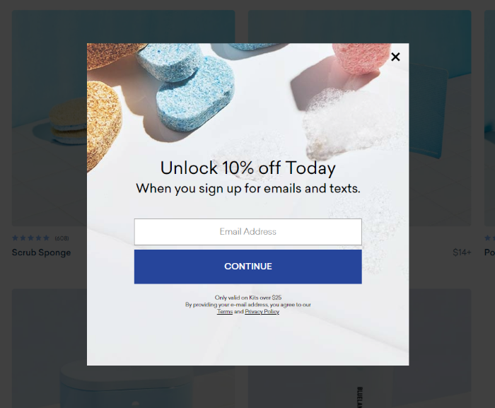
1. Get More Email Sign-Ups Using a Coupon, Like Blueland
Blueland is an eco-friendly cleaning supply company that offers everyday cleaning supplies like dish detergent and hand soap in low-waste packages.
The company grew more than 400 percent last year and drastically increased customers’ lifetime value. While they didn’t share exact conversion metrics for this pop-up, it’s clear they’ve been effective at drawing in new customers.
Why It Works:
The first reason these pop-ups work is the coupon offer. Sixty percent of customers who receive a coupon are willing to try a new product. That’s ideal for a company like Blueland looking to disrupt a well-established market.
The pop-up also keeps it simple by asking for just the email address and uses a bright blue button to drive conversions. The pop-up might perform better by changing the “continue” button to something like “get mine,” but perhaps they’ve already tested it!
2. Double Up on Deals Like Victrola
Victrola, a turntable and record company, doubles up on pop-ups, which I generally wouldn’t recommend.
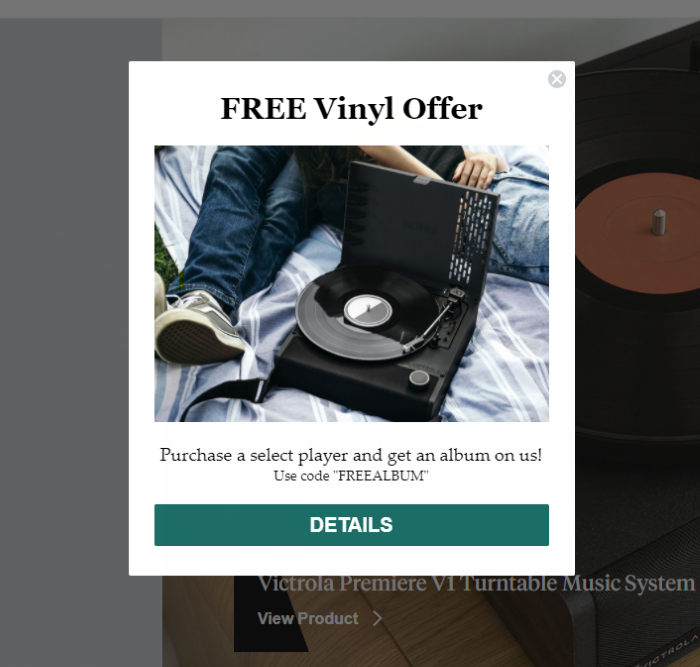
However, they manage to make it work by layering the pop-ups on top of each other. If you close out the 10 percent off pop-up, you’ll see this one hiding behind it with a more tempting offer:
Why It Works:
There are two reasons I think this set of pop-ups work. First, they offer users two different options. That might sound like overkill, but it means users can choose the offer that is most exciting to them.
Keep in mind, these pop-ups don’t pop up separately; they are triggered at the same time, so there’s no frustration of closing one out just for another to open.
There’s another reason it works. According to Sumo, pop-ups on websites that provide context convert 40 percent better than pop-ups that don’t.
The Victrola pop-up example provides context by explaining exactly how users redeem the deal, which instills trust. It’s also a free offer, which users generally love.
3. Use Targeted Pop-Ups Like Leadfeeder
Leadfeeder is a B2B traffic tracking tool that shows companies who visits their website. They use pop-ups to increase email sign-ups, drive demo conversions, and share useful content.
However, they don’t share the same pop-up with every visitor. Rather, they use targeting to share relevant offers based on the pages a user visits. For example, when I visited their podcast page, I was greeted with this pop-up asking me to sign up for their podcast newsletter:
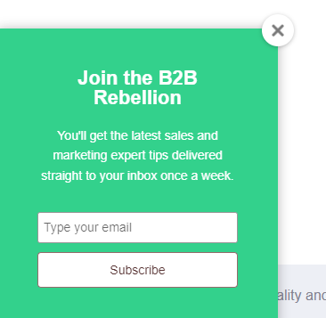
When I visited a page about sales tactics, I saw this pop-up offering a free account-based marketing guide. This is a popular sales and marketing strategy, so the offer is targeted and relevant.

Why It Works:
Leadfeeder’s use of targeted pop-ups helps them deliver more personalized offers—but they don’t overdo it. A recent report found that consumers are more than 3X more likely to abandon brands that “over-personalize.” Leadfeeder’s pop-ups strike the perfect balance.
From a design perspective, they use a simple design and brand colors to grab attention without overwhelming viewers.
4. Use Timed Pop-Ups Like Panther
One of the best ways to overcome the pop-up hate is to wait until users are engaged with your website to show them a pop-up. According to Campaign Monitor, properly timed pop-ups can generate conversions as high as 60 percent—much higher than average.
Panther, a global payroll platform, uses this pop-up strategy on its website.
If you visit their site, you won’t see a pop-up right away. After you’ve looked around for a few seconds, you might notice this at the top of the site:

Why It Works:
Using a time-delay trigger means Panther only shows the pop-up to users who find their site valuable. Placing it at the top of their website is less intrusive and doesn’t block users from viewing the page.
5. Get More Demo Sign-Ups Like Zendesk
Most pop-ups on websites are used to drive email sign-ups. While it can be an effective way to increase your list, pop-ups can do a lot more.
Zendesk, for example, uses a pop-up to increase demo sign-ups:
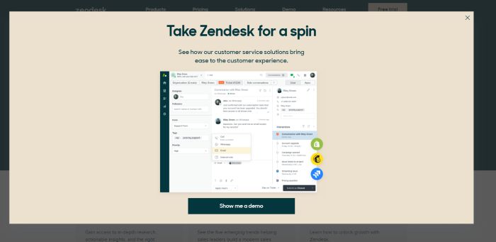
When users stay on the page for several seconds, they’re greeted with this large pop-up that covers most of the page.
You might think the size could cause issues with Google, but it seems to be disabled on their mobile site, so I think they’re safe from the algorithm.
Why It Works:
This pop-up works well due to its simplicity. They use casual language, which is on-brand, and includes plenty of white space. They also offer context, which we already know can increase conversions.
Allowing users to see the dashboard is also helpful in convincing them to take a deeper look at the platform.
6. Keep Users On-Site Like Sitepoint
Nearly 98 percent of site visitors will leave your site without taking action—whether that action is making a purchase or signing up for your newsletter.
One way to improve your conversion rate is to keep users onsite longer, giving you more time to convince them that your company is worth their time.
Increasing time on site is exactly what Sitepoint is going for with this banner pop-up:

Unlike other pop-ups, which often obstruct the website, this pop-up is small and easy to dismiss. It also has a unique goal—they aren’t trying to get you to fork over your email address or make a purchase (at least, not right away.)
Instead, the pop-up focuses on value: “Look at the 600 courses we offer!”
Why It Works:
This pop-up works because it’s unobtrusive, focuses on value, and uses a bright CTA button to attract attention. It also focuses on the value Sitepoint offers, rather than asking the user to give something (like their email address!)
7. Drive Sales Using an Exit-Intent Pop-Up Like OptinMonster
OptinMonster is a marketing tool to help websites improve conversions and monetize their traffic. Unsurprisingly, they have a highly effective pop-up.
Rather than showing every user a pop-up, they use exit-intent software to track cursor location and show a pop-up when users move to close the site or hit the back button. Exit-intent is highly effective, where Popup Smart reports customers see a 4.1 percent increase in conversions and a 53 percent increase in cart recovery after implementing exit-intent pop-ups.
Here’s OptinMonster’s exit pop-up:
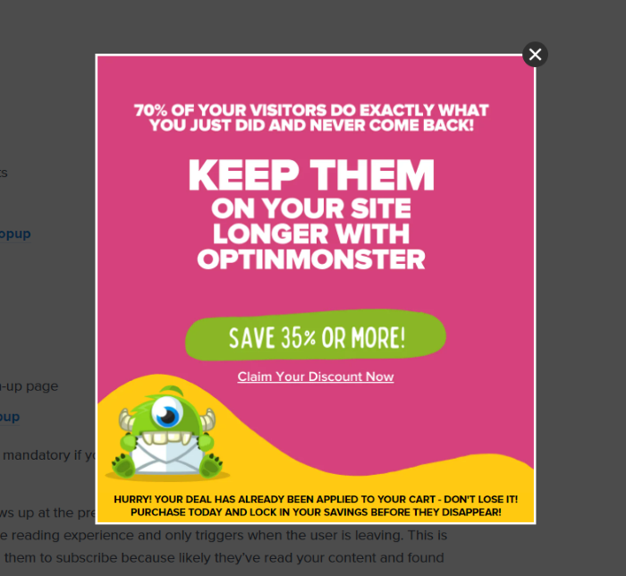
Notice the use of on-brand colors, bold text, and a great offer to draw users in. They also create a sense of urgency with the “Hurry!” copy, which encourages users to convert right now.
Why It Works:
This pop-up works on websites for a lot of reasons. It uses exit intent, which can be incredibly effective on its own. The bold colors and text are eye-catching, and 35 percent off feels like a great deal.
They also create a sense of urgency and describe exactly how their tool can help. The cute monster doesn’t hurt, either.
8. Stand Out With On-Brand Messaging Like Really Good Emails
Really Good Emails is a depository of emails from brands. I love using them for inspiration, and I often use their examples when I talk about email marketing.
That said, I love their pop-up. The brand generally uses casual language, so this pop-up is right on brand. It’s also a bit self-deprecating and acknowledges that many users don’t like pop-ups.
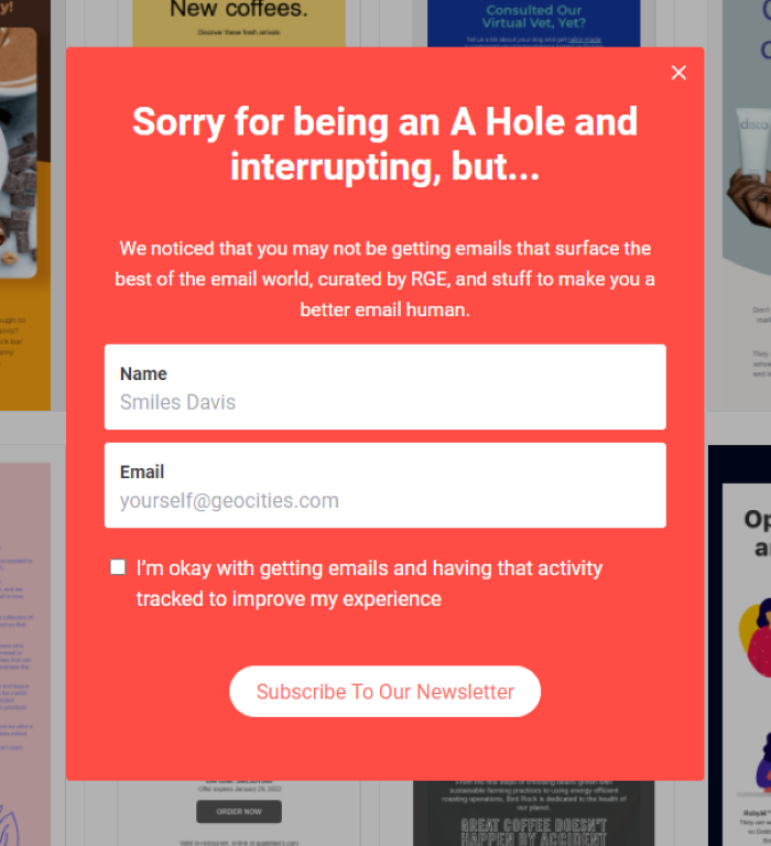
They also keep it simple: there are only two form fields and plenty of white space.
What stands out for me, however, is the copy. In addition to acknowledging some users don’t like pop-ups, they also explain the benefit of signing up.
Why It Works:
This pop-up is effective because it is simple, to the point, and uses on-brand humor to grab users’ attention. The bright colors are also very eye-catching.
9. Use Exit-Intent Pop-Ups Like Thinx
Here’s another exit-intent pop-up from underwear brand Thinx. Like OpintMonster, they only display the pop-up when users are ready to leave their site.
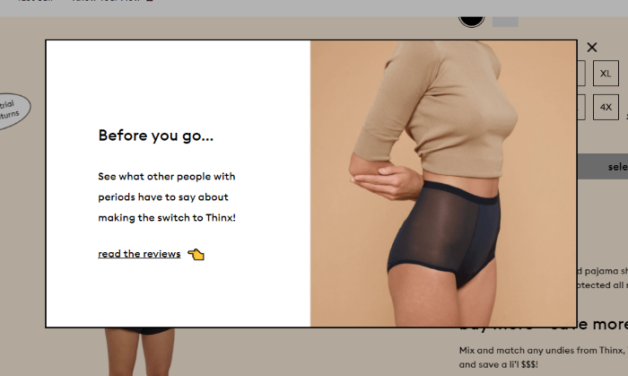
They also include a clear product image that shows off one of their best-selling items. According to OptiMonk, a pop-up on a website with images has an 11.09 percent conversion rate, making them a valuable addition to your pop-ups.
They also encourage users to read reviews, which can increase conversions.
Why It Works:
Thinx uses both exit-intent and product images to increase pop-up conversion rates. They also leverage white space to draw attention to the copy and use an emoji hand to direct attention to their social proof.
10. Use Social Proof in Your Pop-Up, Like Sleeknote
Social proof is powerful. A study by Bizrate Insights found that 32.1 percent of shoppers say a high review or rating is the most important factor when making a purchase decision.
Sleeknote leverages the power of social proof right in their pop-up with this fantastic pop-up example:
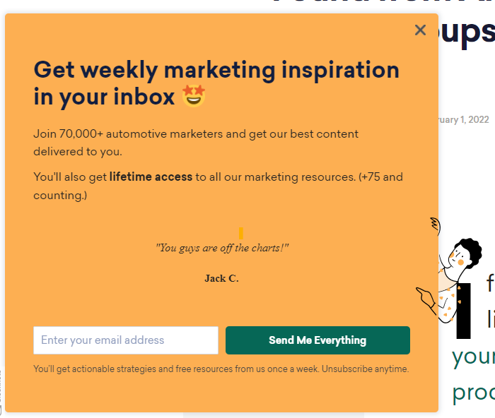
There are two versions of social proof here; the top line encourages you to “Join 70,000 automotive marketers,” while the center of the pop-up uses a direct review from a happy customer.
Why It Works:
Sleeknote combines the power of pop-ups with the conversion power of customer reviews. They also keep the pop-up simple, only offering a few lines of copy spread out over a large background. Plus, they only ask for one single piece of information—your email address.
11. Qualify Leads With Pop-Ups, Like Sendoso
Twenty-seven percent of marketers say their greatest challenge is gathering leads and generating traffic. If you struggle gathering leads, use pop-ups on your website.
Sendoso is a marketing platform for account-based direct mail campaigns. When you visit their site, you’re greeted with this pop-up:
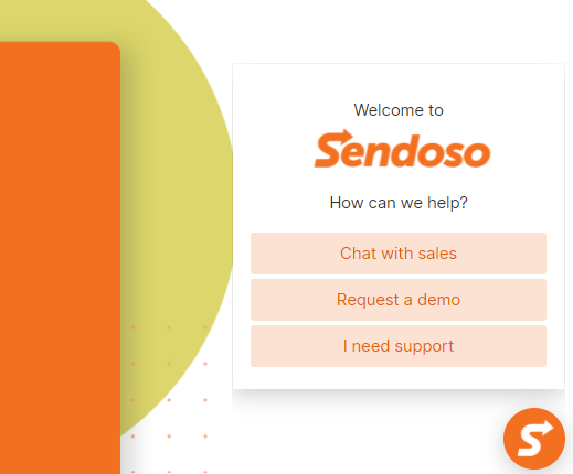
Compared to other pop-ups, this one looks pretty plain. There are no images, no form fields, no social proof. So, why is this one on my list of the most effective pop-ups?
The goal of this pop-up isn’t to increase leads or promote a sale; rather it’s looking to separate people who need support from visitors who are still in the buying funnel.
It separates users even further by asking whether they’d like to speak to sales (meaning they are likely ready to convert) or just want to watch a demo.
Why It Works:
Generating leads is hard. Qualifying leads is even harder. This pop-up directs users to the information they need, making it useful for both the brand and users. They also keep it simple and use branding to build trust with their audience.
12. Offer Something Unique, Like Peter Shankman
Just about every website pop-up offers a 10 percent off coupon, an ebook, or a white paper. While plenty of customers like those offerings, there’s also value in standing out.
Peter Shankman, the founder of HARO, uses this pop-up to attract email sign-ups.
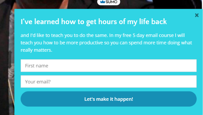
Rather than offering a small discount or download, his offer is a free five-day email course on how to get hours of your life back. Most of us want more hours in the day, making this an incredibly valuable offer that stands out.
Why It Works:
As we’ve seen with other pop-ups, simplicity works. This pop-up uses just a few lines of copy, strong language, an enticing offer, and only two form fields. He also offers an email course, which is different from other offers on the list.
13. Use Striking Images, Like America’s Test Kitchen
Images are important—but not just any image will do. A Venngage study found 40 percent of marketers found original graphics are the most effective type of visual content.
This means your stock photos might not be cutting it.
America’s Test Kitchen website put this strategy to the test with high-quality, original images in their pop-up.
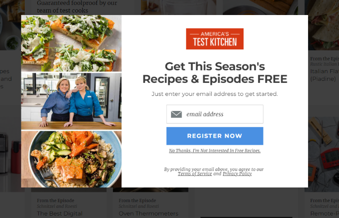
The pop-up features two mouth-watering images of recipes from their book and shows the smiling faces of two of their cooks. Using images of people can also increase conversions, so this is a one-two punch.
Why It Works:
America’s Test Kitchen’s pop-up features high-quality images and an enticing offer of free recipes and episodes. They only ask for one piece of information (an email address) and use their branding to build trust.
14. Keep It Simple, Like Patagonia
Patagonia is an eco-friendly outdoor supply company known for its less traditional marketing strategies.
Here is its pop-up:
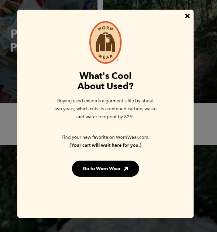
After users add items to their cart, this pop-up appears and prompts them to look at their used items. This seems counterintuitive since used items are less expensive.
However, it works well with Patagonia’s dedication to sustainability. While showing visitors used items might lower their average order value, it also reinforces the company’s dedication to doing things a little differently.
Plus, when users feel like they are getting a good deal, they might actually spend more.
Why It Works:
Patagonia reinforces one of its core brand values (sustainability) by offering shoppers their used options. This builds customer loyalty and promotes a new initiative. The pop-up is simple and confirms that the customer’s cart won’t be affected (which is important to online shoppers.)
15. Offer a Valuable Solution, Like Neilpatel.com
I’ve spent a lot of time testing different pop-ups on websites over the years. For the past few years, I’ve used this one:
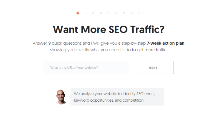
The goal of this pop-up is to drive users to sign up for my free tool, Ubersuggest. It doesn’t gather email addresses at this stage; instead, it focuses on offering value. Just plug in your URL and I’ll deliver a step-by-step action plan to improve SEO on your site.
Why It Works:
This pop-up works well for several reasons:
- First, it’s an incredibly valuable offer. The heading focuses on exactly what the tool delivers: traffic.
- The form is simple and only asks for one piece of information. This is crucial, as HubSpot found the more form fields a form has the less likely users are to fill it out.
- There’s also an image of my face. As we discussed above, adding a human face often increases conversion rates.
Pop Up on Website Frequently Asked Questions
What tools do I need to put pop-ups on my website?
Generally, you’ll only need one tool to install your pop-up. Common pop-up tools include OptinMonster, Wisepops, and Sleeknote. If you use WordPress, there are several plugins you can install.
What's the most common reason for including a pop-up on my website?
The most common reason sites use pop-ups on websites is to gather email subscribers, but they can also help qualify leads, increase customer lifetime value, or encourage demo sign-ups.
Is it expensive to put a pop-up on my website?
No. Several pop-up tools offer limited free plans. Affordable paid plans start as low as $10 a month for a single site with lower page views. For example, OptiMonk has a free plan with unlimited campaigns for sites with 15,000 page views or less.
Do pop-ups on websites work?
They do! The average pop-up has a conversion rate between three and ten percent. If yours converts at a lower rate, test a few of the strategies listed above including focusing on value, limiting form fields, and using timed pop-ups.
Conclusion: Examples of Effective Pop-Ups
Pop-ups on websites are an effective way to increase conversions, build loyalty, and increase customer engagement. To be effective, however, you must consider the user experience. Google lowers the search engine ranking for sites using annoying pop-ups.
Start with a simple pop-up with just one form field and offer something of value. Then, use A/B testing to see if features like timing, targeting, and images impact conversion rates.
Over time, you’ll learn what pop-up features are most effective with your target audience.
Do you use pop-ups on your website? Why or why not?
from Neil Patel's Digital Marketing Blog https://ift.tt/W0apOiV

No comments:
Post a Comment